Modern design teams balance digital precision with tactile production. Successful letterpress printing projects start with four choices. Decide on stock, line weight, type size, colour count, and impression depth. Plan the rest around those calls.
These tips help teams design for letterpress with fewer surprises on press. How you prepare the file, choose stock, and specify the plate decide how confidently the design moves from screen to press. The sections below answer the questions teams raise when a digital file becomes a press proof.
What paper works best for letterpress printing?
For letterpress printing, choose a soft, cotton‑rich sheet with enough thickness to accept impression without show‑through. Popular choices include cotton papers and uncoated mould‑made stocks in the ~300–600 gsm range. A softer sheet lets the image sit into the surface with less pressure, which protects type detail and keeps coverage even. If you need duplexed cards, consider gluing two sheets after printing rather than chasing depth on one sheet.
Choosing the right stock reduces make-ready time and lowers the risk of reprints.
Stock checklist:
- Aim for a tactile, uncoated surface that takes impression and holds ink without mottling.
- Specify weight and calliper that support the finish and prevent show-through on the reverse.
- Ask for a printer’s swatch on your chosen colour rather than a white-only sample.
- If you plan a blind impression, choose a warm‑tone stock where the shadow reads cleanly.
What line weight and type size print cleanly?
Simple, confident artwork prints cleanly. Keep fine lines at ~0.25 pt or heavier and avoid isolated hairlines. Small type often sets cleanly at 6 pt and above on smooth stocks; if you work on textured sheets, step up sizes and open counters a touch to keep them clear. Dots under ~1 pt can risk filling. Avoid large areas of very fine reverse type in dense colours, as solvent‑rich or higher‑tack inks may flood at slower speeds. Clear minimums cut plate remakes and keep pre-press costs predictable.
Practical artwork moves:
- Soften inside corners on tiny shapes so ink does not pool.
- Keep micro‑type away from heavy solids to reduce unwanted gain.
- Use true spot colours and name them clearly in the file.
Can you print photos with letterpress, and when should you use halftones or patterns?
Yes, letterpress printing can reproduce photos but set expectations. Photographs require halftone screens. On tactile papers, the practical screen ceiling tends to be lower than on coated litho stocks. A moderate screen holds more predictably and feels authentic. If the image loses important detail at a realistic screen, consider a duotone with deliberate patterning or redraw as line work. You can sometimes split an image into two plates and run a soft overprint for tone, provided the artwork supports simple registration.
Halftones can look beautiful, but they need testing on your paper. A restrained screen reads better on soft sheets than a very fine pattern that drops out in the fibres. As an alternative, consider patterns or duotones that embrace letterpress texture and play well with impression. Agreeing a realistic screen or a pattern early avoids costly test cycles.
How many colours should you plan for letterpress printing?
For classic letterpress printing, one or two colours deliver a clear result and reduce registration risk. Simpler colour plans cut make-ready time and reduce spoilage on short runs. If you need multiple spot colours, keep overlaps simple and plan for small traps. Metallic inks often sit flatter on absorbent stocks; mix to suit the paper rather than matching a chip made on gloss.
How do you handle large solid areas on soft papers?
- Large, flat solids on soft papers can stipple or mottle. Break them with a subtle pattern or add small negative space to keep coverage even.
- If a design needs a deep block of colour, consider running a light hit, then a second pass. Plan the extra pass into the schedule.
Managing solid coverage reduces spoilage and keeps QC holds off the line.
How deep should the impression be?
In letterpress printing, depth is a taste decision, but evenness is non‑negotiable. Press for a firm, consistent impression that suits the stock rather than a crushed look that distorts the sheet. Heavy pressure can cause show‑through, haloing around letters, or broken fine detail. Aim for an impression you can feel with a fingertip while the back of the sheet stays tidy.
Acceptance criteria that help teams align:
- The image edge feels defined and looks even under raking light.
- The back of the sheet shows a gentle witness rather than a ridge.
- Small counters remain clear and straight strokes remain true.
An even impression lowers reject rates and keeps complaint levels down.
How should you set up artwork handoff for letterpress?
Keep the file simple and unambiguous:
- Supply vector art with spot colours named clearly. Outline type or provide the fonts.
- Keep minimum line weights near 0.25 pt and small type at 6 pt and above, then upsize for textured stock.
- Avoid knockouts that leave hairline bridges; add a sensible trap where two colours meet.
- Indicate trim, fold, and score locations on a non‑printing layer.
If a detail looks delicate, ask the press team to run a quick pull on the chosen stock where possible before you sign off the final plate layout. A clean handoff cuts plate revisions and protects your sign-off date.
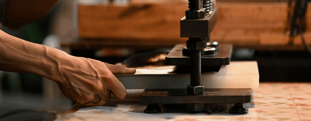
How do plates affect detail and schedule?
Plate choice influences edge shape, small detail, and turnaround time. A plate that holds clean edges helps with small counters, fine rules, and clean knockouts. The plate must sit flat on the base so the impression stays even across the form. If your design mixes micro‑type with areas of solid, talk to the plate maker about relief depth and how they would set the face for clean edges and even coverage.
Metallic Elephant supplies plates for letterpress and can advise on depth and relief that suit your artwork and stock. Fast, consistent plates help to keep proofing loops short and can help protect launch dates on tight runs. Stable plate quality helps keep unit cost steady on short runs.
What makes a piece feel considered and enduring?
Enduring work comes from restraint and intention. Use white space generously, keep colour choices simple, and choose type families designed for print rather than screen. Pair a soft stock with an even, controlled impression, then let the craft speak. Consistency across the run matters more than dramatic depth on a few copies.
Where can you get plates and practical help?
Planning a letterpress project? Start on the letterpress printing page for an overview, then contact us and we’ll help you match stock, artwork, and plates to your timeline.
Written by Metallic Elephant